The Secret Art of Crafting Converting Landers
Every traffic you generate online ought to land somewhere. This is where the landing page comes in. Landers can be different, and in this article, we’ll explore how to make them resonate with your target audience better.
Additionally, we’ll take a look at the difference between landers and pre-landers, explore the pros & cons of making the latter, and give you a few ideas on which landers to use, and how to perfect them. There will be a lot of info to go through, so let’s waste no more time!
Landing Page Explained
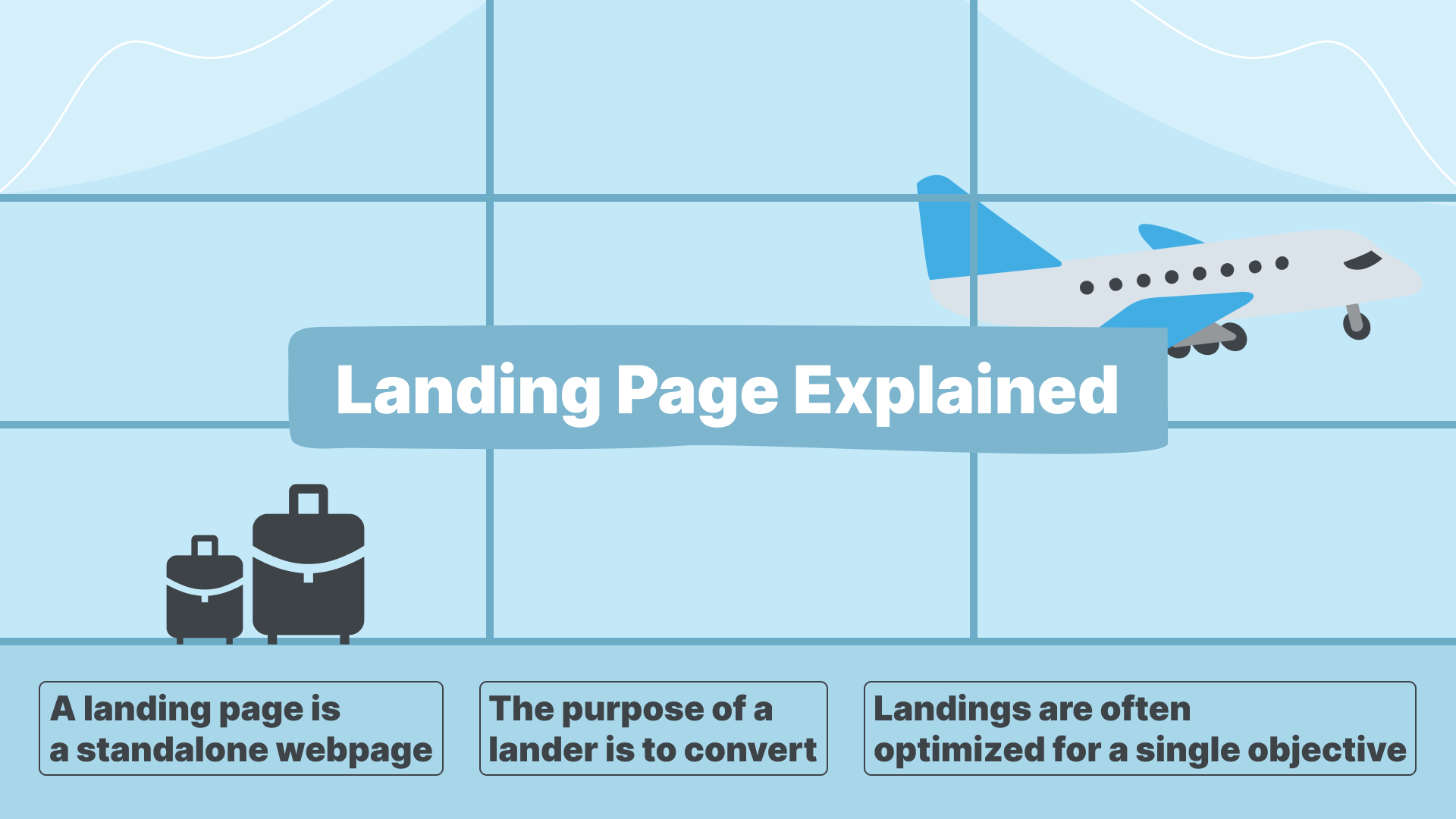
A landing page is a standalone webpage designed for marketing or advertising campaigns. It's where a visitor “lands” after clicking on a link in an email, advertisement, search engine result, or other digital location.
The purpose of a lander is to convert visitors into leads or customers by encouraging them to take a specific action, such as making a purchase, signing up for a newsletter, downloading a resource, or filling out a form.
Landings are often optimized for a single objective and are crafted with persuasive elements like compelling headlines, clear calls to action (CTA), and relevant content.
Landing Page vs. Pre-Lander
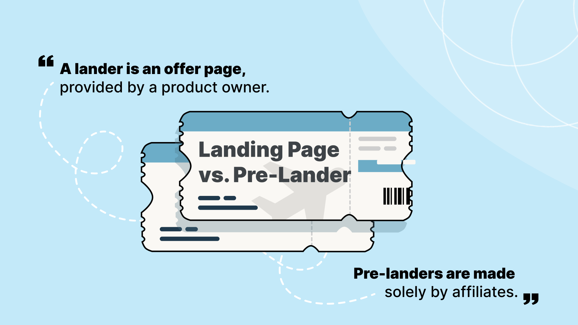
Strictly speaking, a lander is an offer page, provided by a product owner. Generally, an affiliate cannot modify the offer’s page — that’s why it’s important to examine all the details of the offer in advance.
Pre-landers are made solely by affiliates. They are used to smoothen the user’s journey toward conversion, introduce the information gradually, squeeze in more info about the product, add an extra touch of personalization, and bypass the moderation of Google or Facebook.
Pre-sell pages require perfection via split-testing to boost your campaign performance; otherwise, they are more likely to handicap it.
More often than not, affiliate marketers refer to pre-landers as landing pages. Remember, affiliates have no way to design landers, they can only make pre-landers, serving as a bridge between the ad and the offer’s page.
For the sake of simplicity and consistency with the affiliate marketing discourse, we will also refer to pre-landers as landers, unless specified otherwise.
Pre-Lander Pros & Cons
Adding a pre-lander to your marketing funnel grants a few benefits to your campaign. Pre-landers can be used for the following scenarios:
- 🔥 To warm up traffic, so that the users feel even more engaged when landing on the offer page
- ℹ️ To inform the users better by putting less strain on their attention span and introducing the details gradually
- 🤔 To overcome sales objections, so that the audience receives the product more positively
- 🌉 To close the gap between the ad and the offer, as sometimes the transition might be too abrupt
- 🦄 To improve personalization by displaying several pre-landers to various user segments of your target audience
- 💸 To increase the user’s bill via cross-selling by including a few links on the pre-lander to various products
- 🛂 To meet your offer’s KPIs better by filtering out accidental users who do not belong to your target audience and are likely to bounce later
Pre-landers are not flawless, however. Let’s go through the main drawbacks, associated with a pre-lander addition:
- An extra step to funnel, which is to be justified with a good pre-lander; otherwise, it’s a waste of time and attention of the user
- A good pre-lander requires money or time for hosting, translation, copywriting, and designing; but the result is more traffic and cash generated
- A low-quality pre-lander turns the user away, due to lower credibility and lack of respect; counter it by making them more native, succinct, and user-friendly (think about the page you’d love seeing yourself)
- Pre-landers are not always allowed by merchants, so read the terms and conditions carefully
Pre-landers can work with any vertical, including Sweepstakes, Nutra, LeadGens, Software & Utilities, VPNs, Gaming, Betting & Gambling, Dating, and Adult. Let’s take a look at some of the most popular approaches to designing a landing page.
Lander Design Ideas
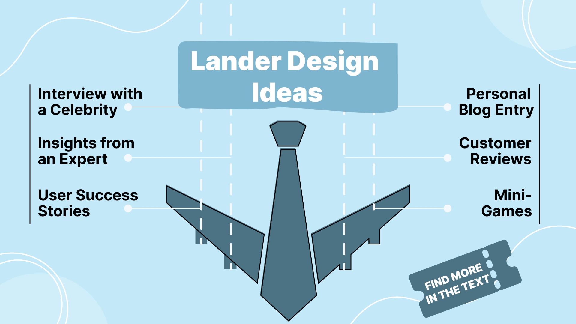
So you’ve made up your mind to design a lander of your own, huh? When making landing pages, you can take one of the following approaches:
- Interview with a celebrity
- Insights from an expert
- Personal blog entry
- Customer reviews
- User success stories
- Mainstream media imitation
- Breaking news & shocking content
- Comparison before and after
- Mini-games
- Surveys
A good lander must solve a user’s problem, an excellent lander should tell a story on top of that. To tell a story, you need five components:
- Hero, revealing their backstory
- Issue, or problem, which is to be solved
- Guide, which nudges the user toward a solution
- Solution, which magically resolves the issue
- Outcome, including emotions, recommendations, reflections
Complement this story with some reviews from the users, who have faced a similar problem and solved it with the product advertised. It’s a good idea to use some unedited product photos, mimicking the average users writing a review and attaching their screenshots.
Perfecting Your Landers
Having decided on the core idea of your lander, you need to focus your efforts on polishing the details. For starters, focus on the following:
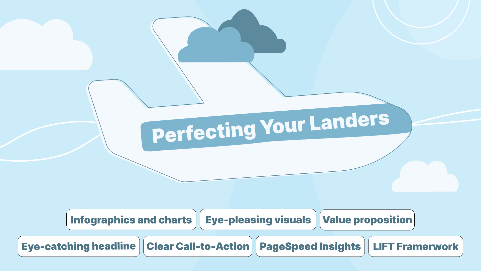
- LIFT framework. There is a core value proposition; conversion catalysts, like clarity, relevance, and urgency; and conversion inhibitors, like anxiety and distraction.
- Your value proposition is a perceived benefit vs. perceived cost equation. Make sure it remains positive and articulate it clearly (clarity).
- Align your lander with the offer for more credibility and top it all with Fear of Missing Out (FOMO).
- Keep anxiety and distraction at bay by adding a few customer-friendly guarantees and keeping just enough elements for the users to convert. Guarantees can include trust certificates, customer testimonials, or flexible refund policy
- An eye-catching headline. Ideally, you need an honest clickbait, i.e., it has to be engaging but believable. To do so, you need to come up with some powerful words and results your audience either wants to achieve or avoid. For example: “Nutritionists Confirm That This Diet Helps to Burn 20 Kilos in a Year”, “How to Become Irresistible With 10 Simple Steps”, “Register as VIP Now”, or “Subscribe for Free Until 12 am”
- Infographics and charts. Visualize as much as possible so that your visitors will understand your offer ASAP.
- Clear Call-to-Action (CTA). It must be easily accessible, have just enough text to nudge into taking action, and be bright enough to capture attention.
- Eye-pleasing visuals. On the other hand, don’t go overboard with flashy design and keep everything eye-pleasing.
- Basic fonts. Steer clear of the exotic fonts, as they might not load on all the devices. Alternatively, make sure the audience segment you’re targeting will see your text.
- PageSpeed Insights. Your lander is an extra step in the funnel, and asking your audience to take a look at it is already a huge favor to ask. Make sure everything loads up fast and smoothly for supreme UX.
- Google Analytics. Use this tool to see how many views your lander generates. It also helps to track bounce rate, average time on page, and top pages.
- A/B testing. Even a copy-pasted lander can be made unique by adjusting its layout, tweaking the colors, and changing pictures. Make sure to start broad and split-test your landers to figure out the best ones.
Things to Avoid
Some practices can hurt your landing page performance. Let’s go through some of the most important how-not-to, shall we not?
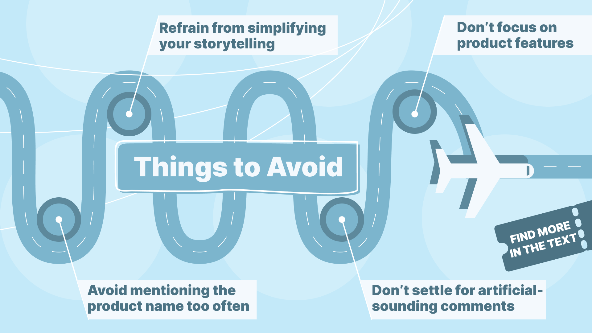
- Avoid mentioning the product name too often to prevent evoking the in-your-face feeling.
- Don’t settle for artificial-sounding comments. Make sure you sound like an ordinary user (grammar mistakes, mention the flaws, add emoticons and emotions). Alternatively, copy-paste a review and add a few tweaks to match your product at hand.
- Refrain from simplifying your storytelling. Here is a problem and here is a solution — won’t do the trick. You need to include the hero, issue, guide, solution, and outcome to make a story arc that captivates.
- Never direct your ad traffic to the home page, provided that it has multiple directions the user can take. Try being more specific by redirecting the users to a page with the desirable action available only.
- Avoid informational overload. Include just enough text to inform the user, evoke some picture in their head, and nudge them into action.
- Don’t focus on product features — highlight a solution to the user’s problems instead.
- Prevent misalignment between your target audience and the creatives you’re using. A Norwegian person would look alienating on the cover of an article for African GEOs.
Conclusion
In crafting converting landers, understanding the distinction between a landing page and a pre-lander is crucial. While pre-landers serve as a bridge between ads and offer pages, they require meticulous attention to design and content to effectively guide users toward conversion.
By leveraging storytelling techniques, implementing the LIFT framework, and conducting A/B testing, affiliates can optimize their landers to maximize engagement and drive results. However, it's essential to avoid common pitfalls such as informational overload, misalignment with the target audience, and directing traffic to the homepage.
By focusing on clarity, relevance, and user-centric design, affiliates can create compelling landers that resonate with their audience and ultimately boost campaign performance. Make sure to contact HilltopAds if you want to know more details about converting landers and their applicability in your particular case.
