


Banners no longer work if you don’t take these 5 key points into account. In this guide, we shared the formula for an effective banner, as well as analyzed examples of well-known companies that will help driving your brand visibility in 2025.
What is Banner Ads?
Banner ads are display ads placed on websites, apps, or platforms to promote a brand, product, or service. These ads are typically rectangular in shape (hence the name “banner”) and can appear in various sizes and formats across the internet:
- Website headers, footers, or sidebars (skyscrapers);
- Within content (in-article ads);
- Mobile apps and games;
- Social media feeds.
A banner ad’s primary objective is to attract attention and provoke a click, which will take the user to a landing page of the offer. Banner ads help with raising brand awareness and driving direct conversions — more than 59% of marketers see display ads with banners in the list as a key point in driving brand visibility.

Dood
Afflift community leader
website: affLift
Most beginners think banner ads work like billboards — just display your message and people will click. The reality is, banner ads require compelling offers and understanding user intent at different stages of the funnel.

Launch your first banner ad with HilltopAds!
How do Banner Ads Work?
Banner advertising operates as a bridge between two key players:
- Advertisers (brands, marketers, affiliates) who want to promote their offer, spread their marketing messages and reach a targeted audience.
- Publishers (with own websites, blogs, apps) who place ads and monetize their traffic.
This connection is typically supported by ad networks (like HilltopAds), which match advertisers with relevant publishers based on targeting criteria (audience demographics, interests, GEO and browsing behavior).
The mechanics of banner advertising in key steps:
Ad placement
Advertisers upload banners to an ad network, specifying their target audience, budget, and bidding strategy.
Auction & delivery
When a user visits a publisher’s site, the ad network runs an instant auction to determine which ad to display. The winner appears on the page.
User interaction
The banner’s job is to:
- Grab attention,
- Deliver a clear, compelling message,
- Stand out from surrounding content,
- Encourage clicks via a strong CTA.
Conversion
If the user clicks, they’re directed to a landing page where the targeted action (purchase, sign-up, download) happens.
Advertisers typically engage with ad networks through various payment models, each with its own advantages and limitations:
CPM (Cost Per Mille/Thousand Impressions)
Advertisers pay a set price for every one thousand times their banner ad is displayed, regardless of whether it’s clicked – the CPM model.
CPC (Cost Per Click)
Advertisers pay only when a user clicks on their banner ad.
CPA (Cost Per Acquisition)
Advertisers pay only when a specific targeted action (an “acquisition”) happens after the user clicks the ad, such as a sale, a form submission, or an app download.
Pro tip: The right model depends on your goals, budget, and the nature of your campaign. But for beginners, CPC or CPA models are safer since you pay only for results. Platforms like HilltopAds offer flexible targeting and optimization tools to maximize ROI.
Register with HilltopAds and get:
- Advanced targeting options
- Direct traffic sources
- Self-serve platform
- Fully-managed service
- Postback tracking
To better understand which model best suits you, we recommend reading our other articles:
Banner Ads Examples that We can all Learn from
Theory is great, but to truly understand the details of a strong banner ad, let’s examine some well-built banner ads as references. All of them are part of marketing campaigns by major brands that have proven design templates and clear rules for creating effective CTAs. We have analyzed in detail what exactly makes them good and identified their weaknesses in order to learn from the experiences of colleagues.
Apple
A global technology company with premium smartphones, computers, and ecosystem of devices and services.

Benefits:
- Instant value proposition: “Get $160–$600 in credit” (clear financial incentive)
- Specific eligibility: Targets owners of “iPhone 12 or higher” (avoids confusion)
- Low-effort CTA: “Get your estimate” (simple next step)
Clarity of message:
— Strong idea. The message is concise and scannable
— Visual hierarchy. Dollar range stands out (bold text, top placement)
— Trust-building. Apple’s milimalistic design and logo show that it can be trusted
Disadvantages:
- Missing urgency — no campaign’s time limit to prompt action
- Confusing footnote — small “4” disclaimer in likely fine print can frustrate users
- Too broad value range ($160–$600) — may cause uncertainty for users unsure about the exact cost of their iPhone model
Potential improvements:
— Add a deadline: “Offer ends July 31” or “Limited-time offer” to create urgency
— Include a device image or trade-in icon for visual appeal
— Move the footnote disclaimer to a tooltip or expandable section
Adobe Creative Cloud
A content creation tool by Adobe, contains access to Adobe’s design tools to help users quickly create graphics, videos, and documents.

Benefits:
- Time-saving promise. “Quickly and easily make standout content” (appeals to efficiency)
- Versatility. Covers “Flyers, social media, and more” to show broad use cases
- Free entry point. “Browse free templates” (low-risk CTA)
Clarity of message:
— Strong headline. “Save time with templates” promotes clear value
— Supporting details. Explains how it works (“thousands of beautiful templates”)
— Clean design. Nice white space, readable font
Disadvantages:
- Visual clash — the lower section (“fiersly run…”) is distracting and unrelated
- Generic CTA — “Browse free templates” could be stronger (e.g., “Start Designing Now — Free”)
- No social proof — missing user stats or ratings (e.g., “Used by 10M+ creators”)
Potential improvements:
— Remove the unrelated “fiersly run” template example to avoid confusion
— Strengthen the CTA with action-oriented phrases: “Create Free Designs in Minutes”
— Add trust elements: Logos of well-known brands using Adobe or a testimonials
WeCanTrack
An affiliate marketing platform that helps publishers track, analyze, and optimize their performance across multiple ad platforms.

Benefits:
- Scale potential.“350+ affiliate integrations” (shows vast network)
- Tool compatibility. Name-drops major platforms (Google/FB/Microsoft Ads) for credibility
- Clear value proposition. “Grow your affiliate income” (direct benefit)
Clarity of message:
— Strong headline.“Unleash your potential” (aspirational yet relevant)
— Technical specificity. Lists exact integrations (appeals to pros)
— Minimalist design. Clean layout with focused CTA
Disadvantages:
- Overly technical — may confuse beginners (no explanation of “affiliate conversion tracking”)
- Weak CTA — “Get Started” is vague (no urgency or incentive)
- No cases — missing the product representation — no dashboards, reports, or UI previews
Potential improvements:
— Simplify the subhead: “Track commissions from 350+ partners—automatically”
— Supercharge the CTA: “Start Free Trial” or “See Live Demo”
— Add trust badges: “Used by 10,000+ marketers” or integration logos
Monday
A work operating system (Work OS) for teams to manage workflows, data, and projects through customizable dashboards.

Benefits:
- Clear visual representation of performance metrics. Monthly revenue, departmental spend, and project health show the real value of the service
- Real-world statistic featured. “VML reports an 11% monthly efficiency gain using the platform.” (numbers represent efficiency)
- Client testimonial with photo. Adds trust and credibility
Clarity of message:
— Focus on benefits. “Lead with clear foresight” ties directly into the platform’s data visibility tool and AI-powered decision-making
— Supporting copy. Explains the use case (strategic goal tracking, cross-org data, risk detection)
— A look inside. The dashboard visual illustrates the concept by showing live data, alerts, and performance indicators
Disadvantages:
- Monday.com brand name is missed — some users may not connect “monday platform” with it
- Too detailed dashboard — hard for a quick glance and could overwhelm
- No clear pricing or entry-level hook — mentioning a free trial or plan might increase engagement
Potential improvements:
— Boost brand recognition and trust: add the full Monday.com logo or include a short descriptor like “by Monday.com”
— Simplify the visual focus: highlight one or two key metrics
— Try more action- and benefit-driven CTA: “Start Tracking Risks Now” or “See AI Insights in Action”
Grammarly
An AI-powered writing assistant to improve grammar, clarity, tone, and correctness in real-time in emails, documents, or messages.

Benefits:
- Real-world example. Shows Grammarly correcting a common error (“everyday → every day”)
- Emotional resonance. Uses a personal success story (“dream job”) to connect
- Tone analysis. Highlights detected tones (Appreciative) to showcase advanced features
Clarity of message:
— Strong hook. “Make Every Word Count” (clear value proposition)
— Demonstration > explanation. The corrected text proves utility instantly
— Friendly design. A conversational tone with emojis feels approachable
Disadvantages:
- No clear CTA — missing a direct next step (e.g., “Try Free Now”)
- Overly subtle branding — Grammarly’s logo/name is small (easy to miss)
- Niche appeal — focused on jobseekers — could broaden to “emails, essays, posts”
Potential improvements:
— Add a bold CTA button: “Grammarly — It’s Free”
— Increase brand visibility: Larger logo or “As used by 30M+ people”
— Broaden the use case: “Perfect your writing—for work, school, or life”
Dood
Afflift community leader
Use the Facebook Ad Library to see what kind of banners competitors are making, and browse websites in your niche to see what banner ads are currently displayed. This steps will inspire you for fresh ideas or campaign angles.
All banners aren’t absolutely perfect, but you can get closer to the ideal
by starting working with HilltopAds right now.
Key Points for Creating Successful Banner Ads
A banner that is both memorable and effective for your business and marketing goals is more than just a picture. Actually it is a picture, but it’s important to be strategic about filling it with content both visual and textual. We’ve put together some tips for creating your own formula of the perfect banner.
Set clear goals
Before designing, define what you want to achieve:
— Brand awareness? (Focus on visuals + logo)
— Traffic? (Strong CTA + click incentive)
— Conversions? (Discounts, free trials, urgency)
Example: a travel agency might prioritize “Book now—30% off!” over a general and unclear “Explore destinations”
Choose the right format & size
— Standard sizes (e.g., 300×250, 728×90, 320×50 for mobile) perform best
— Animated banners (GIFs, short videos) attract ~41% more attention than static ones
— Responsive design ensures visibility on all devices
Pro tip: make sure your banner complies with the technical standards of the ad network you’re partnering with (HilltopAds, Google Display Network, or another one).
Design a banner itself
Pay attention to all of its necessary parts:
Headline & text
— <5 words for quick readability
— Highlight a benefit, not just features (e.g., “Save your time” vs. “Advanced software”)
— Power words like “Free,” “Now,” “Exclusive“
Visuals
— High-quality images/videos (no pixelation!)
— Minimal clutter — focus on one key message
— Contrasting colors to stand out (e.g., bright CTA button on dark background)
CTA (Call To Action)
— Action-oriented (“Shop now,” “Get started,” “Claim offer”)
— Urgency/scarcity, play with users’ FOMO (“Limited time,” “Only 5 left”)
— Bad vs. Good CTA: “Click here”→ “Get 50% off today”
Dood
Afflift community leader
Try to avoid common mistakes in banner ads design like too much text, weak call-to-action buttons that don’t stand out, and trying to say everything instead of focusing on one compelling benefit. Also, using stock photos that look generic instead of showing actual product benefits will not help you to stand out.
Target the right audience
— Demographics (age, location, gender)
— Interests/behaviors (fitness fans for sports outfit offer)
— Retargeting (showing ads to users who already visited your site but didn’t made a purchase)
Example: a gaming app should target mobile users who installed games in similar genre.
Dood
Afflift community leader
Audience targeting is the biggest factor — the right message to the wrong audience will always fail. Design and placement matter, but even low-quality creative will convert if you’re reaching people actively looking for your solution.
Test & optimize
— A/B test different designs, CTAs, and placements
— Track necessary metrics (CTR, conversions, bounce rate)
— Refresh creatives every 2–4 weeks to avoid “banner blindness”
Dood
Afflift community leader
Start with simple A/B tests on headline variations using the same design template. Test one element at a time — colour, headline, or CTA — and use platforms’ built-in split testing features rather than running separate campaigns.
Now you know how to create an effective banner ad
so don’t delay, start right now.
Pros and Cons of Banner Ads
Like any marketing tool, banner ads come with their strengths and limitations. Understanding both will help you set realistic expectations and use this format more strategically.
Pros
Promotes brand awareness
Banner ads are top for getting your brand name, logo, and message in front of a wide audience, even if users don’t click.
Drives truly targeted traffic
If designed well, banner ads can direct users to specific landing pages, special offers, or lead magnets = bringing in traffic that’s already warmed up.
Flexible in design and message
Static images, animated HTML creatives, interactive ads — you are free to choose any format that you see suitable for the campaign.
Scalable across platforms
Banner ads can be sold through networks like HilltopAds, which makes fast scaling available for any niche.
Cons
Low CTR
One of the most common problems is banner blindness — users who are tired of the content all around, subconsciously ignoring ad placements.
Limited conversions
Your conversion rate may be low even if a lot of people click on your well-designed banner — if it doesn’t lead to a landing page with a strong offer and good optimization.
Not effective for all niches
Some products or services — especially those that require complex explanations or high trust — don’t perform well with banners alone.
No immunity to AdBlocker
42.7% of users have ad-blocking software installed, and this number is still growing, which can prevent banners from being shown at all.
How to Work with Banner Ads on HilltopAds
If you’re looking for an effective banner advertising platform, HilltopAds offers powerful tools to launch, optimize, and scale your campaigns. Why choose HilltopAds for banner advertising?
CPC (Cost Per Click) model available
Advertisers pay only for clicks, not just impressions, making the budget work harder.
Personal manager support
Get expert help with campaign setup, optimization, and scaling.
Advanced targeting (10+ parameters)
Reach the right audience with precision.
High-quality traffic
Premium placements with real user engagement.
How to get started
Step 1: Register & set up your campaign
- Sign up for a HilltopAds account
- Choose “Banner Ads” as your campaign type
- Select a traffic channel and frequency cappings.
Step 2: Set up targeting
Choose among specific targeting options that HilltopAds offers:
- GEO (countries, cities)
- Device and OS (mobile, desktop, iOS, Android)
- Interests and keywords
- Languages, browsers, IP, and more.
Pro tip: start with broader targeting, then refine based on performance data.
Step 3: Upload your banners
- Use high-converting creatives (see our previous design tips)
- Recommended formats: JPEG, PNG, GIF
- 300×250 size to maximize reach.
Step 4: Launch & optimize
- Monitor CTR, conversions, and ROI in real-time
- A/B test different banners to find the best-performing creatives
- Adjust bids, targeting, and placements based on analytics
Learn more about banner advertising in our Help Center

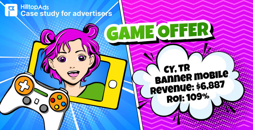
Check out our real case study – HilltopAds partners achieve high ROI by working with us and using this advertising format:
Conclusion
Banners are ads placed on websites, apps, or social media to promote the offer and motivate users to click on it. Many publishers love banner ads for their wide reach, targeting capabilities, and transparent pricing system, which is great for marketing strategies. However, it is important to remember about its vulnerability to ad-blocking software and its ineffectiveness in the face of banner blindness, where users simply scroll past and do not perform the desired targeted actions.
But don’t write off banner advertising just yet. Experts predict that this format will generate more than US$185.44 billion in ad spend in 2025 with expected annual growth of 5.23% (CAGR 2025-2029), which speaks to its effectiveness. Key elements will help you turn banners into your gold mine: a clear goal for the campaign + the right choice of format and size + engaging visual and text design with a clear CTA + correct targeting + constant testing and optimization. And the secret ingredient for success will be cooperation with a trusted partner such as HilltopAds. An advertising network with many years of experience will enrich your strategy with high-quality traffic, powerful targeting (more than 10 parameters), expert support at all stages, and many other features.
Overall, banner advertising offers you a wide range of monetization opportunities, especially with the support of HilltopAds. It’s your turn to take an action!