


Increase conversions in 2026 with proven CRO strategies. Learn how to optimize landing pages, improve UX, reduce checkout friction, build trust, and use A/B testing and analytics to turn more clicks into customers.
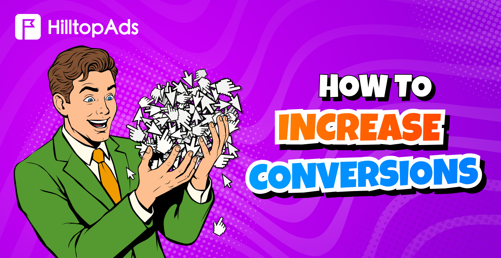
Clicks don’t always lead to conversions. When enough users access your landing page, but only a small proportion converts, the key growth lies within the post-click experience.
That is where conversion rate optimization comes into play. Work in this direction focuses on what happens after the user clicks on your ad. You need to make sure that your message is convincing enough, the offer is easy to understand, and trust signals are visible at the right moments.
Also, it pays to figure out where visitors hesitate and leave your site without performing the target action. Below, you will find a detailed guide on what usually blocks conversions and how to raise them to the desired level.
Launch your HilltopAds ad campaign today
and get access to 273B+ views per month.
How can an Advertiser Increase Conversions?
An advertiser can increase conversions by making the user journey more relevant and easier to complete. This means consistency between the landing page and the ad promise, elimination of unnecessary steps, building trust in advance, mobile optimization, and testing changes based on real user behavior.
The conversion rate (CR) shows the percentage of visitors who have completed the desired action. It may be a purchase, registration, deposit, application installation, form filling, or subscription. To calculate CR, you can divide the number of conversions by the total number of visitors, then multiply by 100.
However, the number you get will not reveal the cause of the problem. Low conversion rates may be caused by many factors, including traffic quality, message effectiveness, page load speed, and more. Therefore, advertisers should see conversion optimization as a full-funnel process and address the following areas:
- Landing page relevance. Users see what they expected after clicking the ad.
- User experience (UX). Visitors understand the page faster and move through it with less effort.
- Checkout or sign-up flow. Fewer users drop off before completing the action.
- Trust signals. Visitors feel safer before sharing data or money.
- Personalization. Different segments see more relevant messages.
- Behavioral analytics. Advertisers find the real causes of drop-offs.
- A/B testing. Changes are validated with data before being scaled.
When running paid traffic campaigns, it becomes all the more relevant. Each ineffective landing page, each bad link, button, or form field can turn purchased traffic into wasted budget.
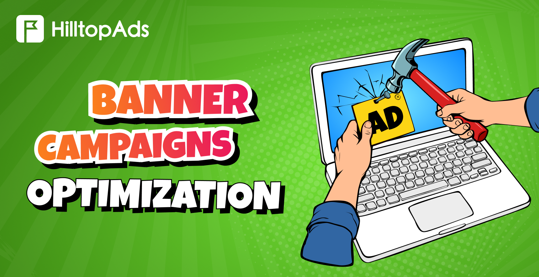
We recommend you to read our new article about optimizing your banner advertising campaign:
Why Visitors Don’t Convert
Even when there is interest in the offer, conversion may not take place. It doesn’t always come down to traffic quality. Often, the post-click experience doesn’t provide enough clarity, confidence, and momentum for the user to perform the desired action.
Expectation mismatch
When clicking on an ad, a visitor expects a certain thing: a discount, a bonus, a free trial, or a fast solution. However, if the page shows a headline unrelated to the initial offer, a user has to figure out the connection. Most people will choose to leave when facing such inconsistencies.
Unclear value propositions
Visitors should understand right away what the offer is and what to do next. Vague wording and long introductions may interfere with this process, especially in the case of cold traffic.
Friction
Things like lengthy forms, too many steps on checkout, hidden costs, weak mobile design, slow loading time, and broken buttons can all make the action feel harder than expected.
Trust
Users who consider actions like purchasing the product or signing up on the website usually expect to find some proof that the site is legitimate and safe. It could include reviews, warranties, well-detailed policies, indications of secure payments, and visible contact det
Mobile experience
On-the-go users often deal with small screens, unstable connections, and many distractions. If the page is not scannable, slow to load, or difficult to interact with, users are more likely to abandon it (even with an offer being relevant).
Register with the best ad network for advertisers HilltopAds
8 Proven Ways to Increase Conversions
The best way to increase conversions is to sequentially improve each step of the user journey. Each tactic below solves a specific problem that can help prevent visitors from leaving without completing the target action post-click.
Match landing pages with ad intent
The landing page should be consistent with the exact promise stated in the ad. When users click on your ad after seeing some offer like a discount, free trial, bonus, or specific solution, the first screen should convey the same message.
The missing connection between the ad and the landing page leaves users with no clue about what they’re getting into. They might feel that they’re in the wrong place, which often causes early drop-offs, despite the traffic being relevant. To handle this issue, experienced advertisers create separate landing pages specifically targeted to certain GEOs, devices, offer types, or traffic sources. For example, an ad that says “quick mobile installation” should lead to the page explaining the mobile setup, speed, and the next action, rather than a broad homepage listing all the features.

Helena
Senior Sales Manager HilltopAds
The fastest conversion growth without increasing the budget often comes from refreshing creatives and pre-landers. Users gradually stop reacting to the same ads, so advertisers need to update the pre-click and post-click experience regularly. It is also important to disable underperforming traffic sources, set up postback tracking, and use auto-rules to avoid spending budget on impressions that do not lead to conversions.
Create a stronger value proposition
Your message as an advertiser needs to get through within a few seconds. The page you’re sending visitors to should answer these questions precisely:
- What is being offered;
- Why it matters;
- Why should a user choose it now?
Low-converting pages tend to talk about features, not the benefits of using them. More effective ones, in turn, make a connection between your product and the user’s actual pain point. For instance, instead of a slogan like “Advanced marketing solution”, consider a more specific message like “Find which traffic sources drain your budget before scaling up.”
In this case, users will not have to spend too much time figuring out how the product benefits them. A headline, short supporting text, 3-5 bullet points listing the main benefits, and one visible CTA are usually enough for the first screen.
Reduce friction during checkout
Users leave the funnel mainly because the final step is too lengthy, unclear, or risky for them. Long forms, obligatory account creation, hidden costs, limited payment options, weak error messages, and confusing design of the checkout process can all lower conversion rates.
It makes sense to start by finding out what stage causes the highest drop-off rate. It can be a form start, checkout start, the attempt to pay, or the final confirmation step. In case many users initiate the process but do not complete it, the problem is likely related to the funnel itself.
Advertisers can test shortened forms, guest checkout, clearer pricing, visible payment options, better error messages, and progress indicators. These actions could not only help raise the conversion rate but also reduce the number of warm users lost at the final step.
Build trust with reviews and guarantees
Many potential customers try to find evidence that what they see on the landing page is trustworthy before they make a purchase, register, or share their personal data. Pages that do not provide enough trust signals often make users hesitate.
Elements like user reviews, testimonials, guarantees, return policy information, secure payment indicators, and visible contact information can help reduce that hesitation. These cues are especially efficient if used near the decision-making points (the CTA, pricing block, form, or checkout button).
The trick here is relevance. Stock icons or anonymous reviews will hardly influence user behavior.
See how advertisers achieve outstanding results with HilltopAds:


Optimize CTA buttons
A CTA should make it clear what will happen next for the user. Ambiguous buttons like “Submit” or “Continue” may lead to confusion, particularly for users who are not familiar with the brand or offer yet.
More effective CTA copy ties the action to an outcome. Some worthy examples include: “Start free trial,” “Get my quote,” “Check availability,” “Create account,” and “Claim bonus.” Moreover, the CTA should be easily visible, placed where the user is ready to take action, and repeated organically throughout long pages.
CTA optimization can also help eliminate the moment of doubt from the decision-making process. Small things like the button text, placement, contrast, supporting microcopy, and reassuring copy like “No credit card required” or “Under 1 minute” may prove effective.
Improve mobile experience and page speed
Mobile users tend to skim faster, get distracted easily, and leave pages that appear to be slow or difficult to navigate. A landing page might look great on desktop but perform poorly on mobile.
It makes sense to check whether the offer is visible above the fold, the CTA button is easy to tap, the text is readable, forms are simple enough, and pop-ups are not blocking the page. Page speed is also important, since a delay would make users frustrated even before they start evaluating the offer.
Mobile and desktop should be analyzed independently. When the overall conversion rate looks average, the mobile version might be underperforming despite good desktop performance.
Use behavioral analytics and A/B testing
The conversion optimization process should rely on user behavior rather than assumptions. Analytics can point out where visitors stop on the site. Heat maps and session recordings, in turn, reveal how users interact with the page.
A/B testing helps confirm whether the change really brings any performance improvements. Instead of experimenting with multiple factors (the headline, CTA, layout, form, and images) all at once, advertisers should test one hypothesis.
For instance: “Mobile users do not notice the CTA because it is placed too low. Moving it higher should increase form starts”. Such a hypothesis-based test should be more useful than a random design modification, as it links the experiment to a specific conversion problem.
Recover abandoned visitors with remarketing
Not every potential customer who is interested in the offer will convert during the first visit. Some may look at different offers, get distracted, need more evidence, or plan to come back later. Remarketing helps reach such users with a message that is appropriate for their previous behavior.
Based on the stage at which the potential customer left the process, remarketing messages may vary. For those who visited the landing page, it may include additional details about the benefits. Those who looked at pricing may need reassurance or a comparison. In case of an abandoned checkout, a reminder or simplified next step may prove effective.
Remarketing works best when major problems within the funnel are already solved. It should not be used to compensate for inefficiencies like a slow page, unclear offer, or broken checkout. Its purpose is to win back those users who were interested enough, but needed more time or confidence to complete the action.

Register with HilltopAds and get:
- Advanced targeting options
- Direct traffic sources
- Self-serve platform
- Fully-managed service
- Postback tracking
Tools That Help Advertisers Improve Conversions
Conversion rate optimization gets easier once advertisers start moving past surface-level indicators. Clicks, CTR, impressions, and CPM are useful metrics, but they may fail to present the full picture of what happens after the click. A good conversion rate optimization framework will try to answer the questions:
- Where do visitors come from?
- Where do they drop off?
- Why do they hesitate?
Google Analytics 4 helps track traffic sources, landing page performance, events, and key actions. GA4 allows for flagging key events, which helps advertisers understand how channels contribute to meaningful actions.
Behavioral tools like Microsoft Clarity and Hotjar can give insights into UX problems that may not be evident through analytics alone. Platforms for A/B testing, like VWO and Optimizely, help advertisers test their hypothesis before making the change permanent. In VWO, the emphasis is on analysis, optimization, and personalization of online experiences. Optimizely facilitates web experiments.
| Purpose | Tool | Why advertisers use it |
| Analyze traffic sources and the conversion funnel | Google Analytics 4 | The industry standard for tracking traffic channels, landing pages, key events, user journeys, and funnel performance. |
| Understand why visitors don’t convert | Microsoft Clarity | Offers free session recordings, heatmaps, rage clicks, and dead clicks to uncover friction points that prevent conversions. Many marketing teams start their CRO analysis with Clarity. |
| Conduct deeper UX research | Hotjar | Combines heatmaps with recordings, surveys, feedback tools, and user research features to understand behavior and identify usability issues. |
| Validate optimization ideas | VWO | One of the widely used A/B testing platforms for small and medium-sized businesses, helping teams test landing pages, CTAs, and user flows before making permanent changes. |
| Run enterprise-scale A/B testing | Optimizely | Designed for larger organizations running continuous experimentation programs. It offers advanced testing capabilities but may be too feature-rich and expensive for many small advertisers. |
The exact composition of the tool stack depends on factors like traffic volume, budget, and team maturity. A smaller advertiser could start off with GA4 and Microsoft Clarity. A bigger team that runs lots of tests might need VWO or Optimizely.
Read our article on how experienced advertisers determine high-quality traffic:

Common mistakes advertisers make
Even heavy traffic can fail to perform if advertisers are optimizing the wrong elements within the marketing funnel. Such mistakes are common, and initially they may look like minor blunders. However, each one can hide the true reason for the lack of conversions.
Optimizing for averages instead of segments
A campaign can have an acceptable average conversion rate. Meanwhile, mobile traffic, certain GEOs, placements, or traffic sources may be performing much lower than others.
Solution: Conversion analysis should be performed based on device, GEO, placement, traffic source, browser, funnel step, and new vs returning users before adjusting bids or budgets.
Helena
Senior Sales Manager HilltopAds
Some old conversion tips now work much worse than before. For example, advertisers should not expect one creative to perform for months or assume that broader targeting always brings better results. Campaigns should be evaluated not only by CTR, but mainly by conversions, CPA, and ROI.
Scaling campaigns before fixing conversion issues
In case of issues with the landing page, checkout, tracking, or value proposition, additional budget will just bring more traffic into the same faulty funnel. High CTR does not mean the campaign is ready for scaling.
Solution: Analyze post-click KPIs first – CPA, ROI, CTA clicks, form submissions, checkout drops, lead quality, approvals, revenue per user, or recurring actions.
Testing too many changes at once
Changing the headline, CTA, layout, form, pricing block, and images all in one go complicates the interpretation of testing results. If performance increases or decreases, you will struggle identifying what caused the effect.
Solution: Test one single hypothesis at a time, especially in cases of low traffic volume. For instance, test CTA placement first, then proceed to experiments with the form length or headline copy.
Ignoring post-conversion experience
A conversion is not necessarily the ultimate business goal. Additional sign-ups or leads can be of no use if the visitors do not activate, deposit, repurchase, or pass qualification.
Solution: Measure what happens post-conversion: lead quality, approval rate, first-time purchase, deposit quality, retention, refund, and lifetime value.
Using AI-generated copy without validation
The use of AI can help create headlines, calls-to-action, FAQ content, and landing pages quickly. However, AI may also come up with too generic copy with weak positioning or promises that do not match what you are actually offering.
Solution: Use AI copy as a draft only. Validate it against product facts, customer concerns, legal requirements, brand voice, and A/B test results.
Conclusion
Higher conversion rates do not happen due to one single change. Success comes from an ongoing effort to understand your users, reduce friction, and optimize every step of the funnel.
To optimize conversions without increasing their advertising budget, advertisers need to look beyond the ad itself. Once a click occurs, the landing page must be in line with the user’s intent, with a clearly stated offer, enough credibility, and an easy checkout process. The data should help reveal where users hesitate.
Systematic optimization tends to deliver better results. It can be achieved through traffic segmentation, user behavior analysis, hypothesis testing, and keeping the changes that improve your KPIs. While a one-time redesign can give you an initial boost, repeatable conversion optimization is more likely to bring you consistent growth over time.